matplotlib을 1년 넘게 썼는데 matplotlib.widgets같은 기능이 있는 줄 몰랐다. mpl에 이런 게 있었으면 좋겠다~ 하고 있었는데 이미 있던 것들이었다. 까먹기 전에 적어놔야지.
Slider, Button, RadioButtons - mpl 공홈, 내 Git
일반 버튼, 슬라이더랑 똑같다!!


sin 함수의 폭과 진동수를 조절하는 mpl 데모 예제이다.
코드를 뜯어보자.
fig, ax = plt.subplots()
plt.subplots_adjust(left=.25, bottom=.25)
- subplot을 생성해서 figure와 axes 객체를 받는다. 각 영역은
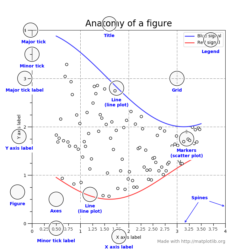
그림과 같다. Figure는 창 전체를 컨트롤하고 Axes는 각 그래프를 개별적으로 컨트롤한다. 지금처럼 subplot이 한 개이면 fig.과 plt.이 거의 똑같이 작동한다.
- Figure 안에서 subplot들의 위치를 설정한다. 상하좌우를 파라미터로 넣어줄 수 있고 .25라는 것은 해당 창을 기준으로 25% 크기라는 뜻이다.
t = np.arange(0.0, 1.0, 0.001)  # plot tick
a0 = 5
f0 = 3
s = a0 * np.sin(2 * np.pi * f0 * t)  # 최초 plot
l, = plt.plot(t, s, lw=2, color='red')
plt.axis([0, 1, -10, 10])  # x값 시작, 끝, y값 시작, 끝
- Tick은 plot의 해상도 정도로 생각하면 적당할 것 같다. 대충 구간을 1000개 정도로 나누면 부드러워보인다
- Initial plot을 설정한다. 사용한 함수는 $y = a_0 \sin (2\pi f_0 t)$이다. 줄 너비는 2px, 색은 빨강으로 설정한다.
- plt.axis로 그래프가 보일 범위를 설정해주면 된다. 넘겨줄 값은 [x값 범위, y값 범위]이다.
axcolor = 'aliceblue' # 왼쪽 하단을 원점으로 했을 때, Slider의 영역. [영역 왼쪽하단 x, y, 영역 가로, 영역 세로]
# ax 객체의 메소드로 실행하면 ax의 원점 기준으로 그려짐
axamp = plt.axes([0.25, 0.15, 0.65, 0.03], facecolor=axcolor)
axfreq = plt.axes([0.25, 0.1, 0.65, 0.03], facecolor=axcolor)
sfreq = Slider(axfreq, 'Freq', 0.1, 30.0, valinit=f0)  # 최소, 최대, 디폴트
samp = Slider(axamp, 'Amp', 0.1, 10.0, valinit=a0)
- Slider의 색을 설정해준다. 색 이름표는 여기에서 확인할 수 있다. 색깔이 대부분 구리다.
- 폭 슬라이더와 진동수 슬라이더의 위치를 설정해준다. 똑같이 해당 창의 %크기로 값을 넣어준다. 파라미터는 [좌측하단 좌표, 너비, 높이]이다.
- Slider 객체를 생성해준다. 파라미터는 (위치, 이름, 값범위, 초기값) 이다.
def update(val):
    amp = samp.val
    freq = sfreq.val
    l.set_ydata(amp * np.sin(2 * np.pi * freq * t))  # amp 와 freq을 변수로 만듦
    fig.canvas.draw_idle()  # 버그 방지
    sfreq.on_changed(update)  # Slider와 연결
    samp.on_changed(update)
- 값이 변할 때마다 실행될 업데이트 함수를 연결한다.
- 그냥 plt.draw() 해도 되는데, 저렇게 하면 간헐적으로 발생하는 버그가 방지된다고 한다.
resetax = plt.axes([0.8, 0.025, 0.1, 0.04])  # 리셋버튼 영역
button = Button(resetax, 'Reset', color=axcolor, hovercolor='0.5')  # hovercolor : 마우스 올리면 어두워지는 건데 버그잇듬
def reset(event):
    sfreq.reset()  # Slider method
    samp.reset() button.on_clicked(reset)  # 버튼과 연결
- 리셋 버튼을 연결해준다. 슬라이더랑 함수 이름만 다르고 다 똑같다.
rax = plt.axes([0.025, 0.5, 0.15, 0.15], facecolor=axcolor)
radio = RadioButtons(rax, ('red', 'blue', 'green'), active=0)  # 색깔 고르기 버튼
# 영역, 라벨 및 버튼, 디폴트
def colorfunc(label):
    l.set_color(label)  # 메인 plot 객체
    fig.canvas.draw_idle()
    radio.on_clicked(colorfunc)
- 라디오 버튼을 연결해준다.
- 기능은 예상과 다르지 않다.


plt.show()
그린 도표를 띄운다.
CheckButtons - mpl 공홈, 내 Git
이런 식으로 사용할 수 있다.


코드는 위 예제랑 거의 비슷하니 핵심적인 부분만 살펴보자.
t = np.arange(0.0, 2.0, 0.01)
s0 = np.sin(2*np.pi*t)
s1 = np.sin(4*np.pi*t)
s2 = np.sin(6*np.pi*t)
fig, ax = plt.subplots()
l0, = ax.plot(t, s0, visible=False, lw=2, color='k', label='2 Hz')
l1, = ax.plot(t, s1, lw=2, color='r', label='4 Hz')
l2, = ax.plot(t, s2, lw=2, color='g', label='6 Hz')
plt.subplots_adjust(left=0.25)
lines = [l0, l1, l2]  # Make checkbuttons with all plotted lines with correct visibility
rax = plt.axes([0.05, 0.4, 0.1, 0.15])
labels = [str(line.get_label()) for line in lines]  # plot.get_label()
visibility = [line.get_visible() for line in lines]
check = CheckButtons(rax, labels, visibility) # visibility는 초기값으로 쓰려고 넘기는 듯
def func(label):
    index = labels.index(label)
    lines[index].set_visible(not lines[index].get_visible())
    plt.draw()
    check.on_clicked(func)
    plt.show()
- 보여줄 함수 개수만큼 생성해서 배열로 묶어준다.
- CheckButtons.on_clicked는 콜백에 label을 넘겨준다. labels 배열을 참조해서 인덱스를 얻어내면 되겠다.
- lines.Line2D._visible을 메소드로 껐다 켜주면 된다.
짬뽕
이제 내가 생각하던 걸 만들 수 있다. 옛날에 DSP 배울 때 이걸 알았으면 더 쉽게 이해할 수 있었을 텐데 조금 아쉽다.


폭과 주기가 다른 sin함수들을 합치는 plot이다. 몇 년 동안 계속 머릿속에만 있었는데 이제야 구현했다.
t = np.arange(0.0, 1.0, 0.002)
a0, f0 = 5, 3
s0 = a0 * np.sin(2 * np.pi * f0 * t)
- 함수를 초기화 해준다.
fig, ax = plt.subplots(figsize=(13., 7.))
line, = plt.plot(t, s0, lw=2, color='black', label='main')
sub1, = plt.plot(t, s0, lw=2, color='red', alpha=.1, label='plot 1')
sub2, = plt.plot(t, s0, lw=2, color='green', alpha=.1, label='plot 2', visible=False)
sub3, = plt.plot(t, s0, lw=2, color='blue', alpha=.1, label='plot 3', visible=False)
sublines = [sub1, sub2, sub3]
ax.axis([0, 1, -10, 10])
ax.legend(loc=2)
func0 = 'sin(2pi * 5 * t)'
text = ax.text(.99, 9.7, func0, size=10, ha='right', va='top')
top = .95
left = .
right = .66
# bottom : .11
plt.subplots_adjust(left=left, right=right, top=top)
sliderw, sliderh = .25, .03
smallgap = .04
biggap = .065
axcolor = 'aliceblue'
- figsize의 단위는 인치이다.
- alpha값을 넣어 plot이 뒤에 깔리게 한다.
- 텍스트도 추가했다. 함수식이 자동으로 업데이트 되도록 했다.
amp_sliders = []
freq_sliders = []
for i in range(3):
    ampx, ampy = right + .05, top - sliderh - smallgap * i - biggap * i -.2
    freqx, freqy = right + .05, top - sliderh - smallgap * (i + 1) - biggap * i -.2
    boxamp = [ampx, ampy, sliderw, sliderh]
    boxfreq = [freqx, freqy, sliderw, sliderh]
    axamp = plt.axes(boxamp, facecolor=axcolor)
    axfreq = plt.axes(boxfreq, facecolor=axcolor)
    amp_sliders.append(
        Slider(axamp, 'Amp ' + str(i+1), .1, 10., valinit=a0)
    )
    freq_sliders.append(
        Slider(axfreq, 'Freq ' + str(i+1), .1, 30., valinit=f0)
    )
- 슬라이더를 폭, 진동수 각각 세 개씩 만든다.
axcheck = plt.axes([0.78, 0.25, 0.1, 0.15])
labels = ['Plot 1', 'Plot 2', 'Plot 3']
active = [True, False, False]
check = CheckButtons(axcheck, labels, active)
axreset = plt.axes([0.93, 0.025, 0.05, 0.04])
butreset = Button(axreset, 'Reset', color=axcolor, hovercolor='0.5')
- 체크박스와 리셋 버튼도 만든다.
def update_slider(val):
    amps = [samp.val for samp in amp_sliders]
    freqs = [sfreq.val for sfreq in freq_sliders]
    graphs, funcs = [], []
    for (amp, freq, act, sub) in zip(amps, freqs, active, sublines):
        if act:
            funcs.append('{:.2f}sin(2pi * {:.2f} * t)'.format(amp, freq))
            graphs.append(amp * np.sin(2 * np.pi * freq * t))
            sub.set_ydata(amp * np.sin(2 * np.pi * freq * t))
        main_ydata = sum(graphs) / sum(active)
        line.set_ydata(main_ydata)
        text.set_text(' + '.join(funcs))
    plt.draw()
- 그래프 업데이트할 때 y범위를 벗어나지 않도록 평균을 취해줬다.
- np.array가 list 안에 들어있어도 sum으로 element-wise하게 합칠 수 있다. sum이 +연산자를 사용하는 것 같다.
def update_check(label):
    index = labels.index(label)
    active[index] = not active[index]
    sublines[index].set_visible(active[index])
    ax.legend(loc=2)
    update_slider(0)
- 라벨(legend)도 업데이트 해준다.
- 업데이트 부분은 slider 코드와 똑같기 때문에 복붙
def reset(event):
    for (samp, sfreq) in zip(amp_sliders, freq_sliders):
        samp.reset()
        sfreq.reset()
        text.set_text(func0)
- text는 reset메소드가 없다.
check.on_clicked(update_check)
butreset.on_clicked(reset)
for (samp, sfreq) in zip(amp_sliders, freq_sliders):
    samp.on_changed(update_slider)
    sfreq.on_changed(update_slider)
zip zip zip
plt.show()
하..끝났다.
p.s 기본 빌트인 메소드는 다른 색으로 좀 칠해줬으면 좋겠다.